La Cocina
Website Catering Page Redesign
Project Overview:
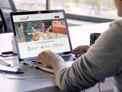
Our client, La Cocina is a non-profit restaurant incubator based in San Francisco. They were looking to revamp their site and asked us to redesign their catering experience and flow.
Teammates: Polly, Cez, Yanning
Programs & Tools:
Illustrator
Sketch
InVision
Role:
User Research
Competitive Analysis
Survey
User Flows
Wireframing
Usability testing
Click-through prototype
DISCOVER
The Client
La Cocina is a nonprofit incubator kitchen that works with low-income immigrant food entrepreneurs to provide the resources to overcome the barriers of running a successful catering business in the United States. La Cocina wanted to emphasize the story of their entrepreneurs' business endeavors, while showcasing their work, educating visitors about the catering process, and simplifying the request process.
After our initial stakeholder meeting and learning about their deeper goals, we began taking stock of and performing a heuristic evaluation of La Cocina's website.
Research
As a team we immersed ourselves in research using contextual inquiry, heuristic evaluation, affinity and surveys to understand catering services and who the potential users were.
We looked for answers to the following:
- Who are the typical catering clients?
- What type of events are being catered for?
- What is good and bad in the catering experience?
- What makes clients order from La Cocina?
- What makes clients order from the competition?
Surveys
We also formulated a survey tailored towards anyone who had ordered catering, with the intention of identifying user types and finding patterns in behavior.
Our survey results indicated that we should target office managers and newlyweds (or people planning a wedding) for further user research. After interviewing these two user types, we began to synthesize our results using affinity and empathy mapping, categorizing our findings to identify gain and pain points for each user type.
Competitive Analysis
Competitive analysis played a large part in helping us decide what features to include, and exclude, from the catering page.
We analyzed other catering sites, looking at strengths and weaknesses and paying close attention to visual look and feel, business models, functionality and features, especially ones that encouraged efficiency in the catering request process.
Personas
The research findings informed the creation of our primary persona, an office manager.
Experience Mapping
We created an experience map that took our persona through the task of finding catering and the experience of using our clients website. From here, we started to hone in on our personas gain and pain points and focused on what we needed to address in our designs.
DEFINE
Through stakeholder meetings and user research we found a few major pain points:
- Stakeholder was wasting time educating potential clients
- Website did not provide pertinent information
- Catering process was not clear
- Request form was too long
- Potential clients have limited time to spend on tasks
- Stakeholder was losing potential clients and revenue
DEVELOP
Design Studio and Paper Prototypes
We used the design studio technique to sketch lo-fidelity wireframes and began testing a paper prototype of the design that addressed our pain points most effectively. We received valuable feedback from these tests and iterated until we reached a design that balanced the needs of the users, as well as met our stakeholders requirements.
High Fidelity Wireframes
We moved onto creating digital wireframes adding a higher level of fidelity and interactivity. After conducting usability tests and iterating on the feedback we received, we moved onto creating an interactive mock-up. Further testing led to additional iterations before presenting the final deliverables to the client.
Prototype
Further testing led to additional iterations before presenting the final deliverables to the client.


